Another One of My Heroes Has Left

Carroll Shelby 1923-2012

As a teenager growing up in rural Victoria, Australia, getting hold of a copy of the American car magazine Road and Track was a major event.

Each issue had photos and articles about the glossy dream machines produced by the US auto industry, and pictures and articles about the muscle cars, NASCAR racers and other motor racing exotica.

That’s how I learned about a man called Carroll Shelby, a Texan who seemed very close to being a nutcase. Put a 427 cubic inch V8 motor into a dainty little English sports car body? Of course and you end up with the fearsome Shelby Cobra 427 s/c. He followed this up with the totally insane ‘Super Snake’ of 1967. Not content with a 7 litres in a small English sports car, he built two with twin superchargers, one for himself and one for his friend comedian Bill Cosby. The myth has it that Cosby only drove his once and it scared him so badly he sold it straight away. The Super Snake impressed, or terrified, Cosby so much he turned the experience into one of his famous stand up routines – 200 mph, the speed the Super Snake would go. The car Shelby built for himself sold for $5.5 million in 2007.

Carroll Shelby was responsible for, or had a hand in the development of, the legendary Ford GT40 and its wins at Le Mans, the Shelby Cobra, the Shelby Mustangs, the Sunbeam Tiger and various other cars such as the DeTomaso Pantera and the Dodge Viper

He also fueled my interest (OK, obsession) with American muscle cars and the Mustang in particular. It is a direct line from the teenager reading about Carroll Shelby in Road and Track in the ’60s and the black machine sitting in my garage,
RIP Carrol Shelby

It was quiet, too quiet…

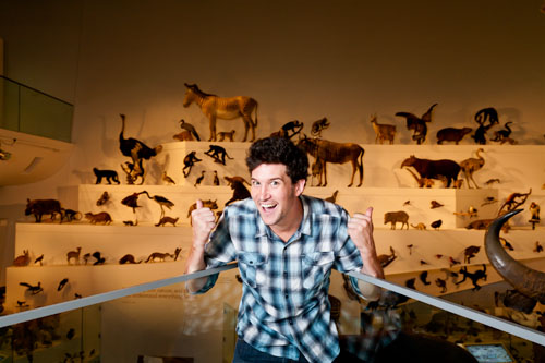
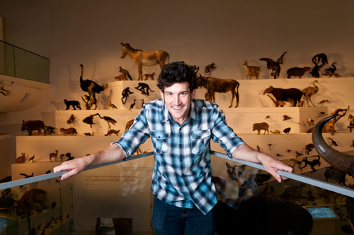
It was early morning at the Melbourne Museum and the animals weren’t stirring or making a sound. Not surprising really, they were all long dead and stuffed. But that didn’t stop actor Dave Lamb from getting excited about seeing them as he prepared for his part in this year’s Museum Comedy.

Dave Lamb getting excited

Dave loved the idea of being able to present a room full of dead animals to the Museum Comedy patrons, he was really getting quite excited as our photoshoot progressed.

Dave Lamb getting quite excited

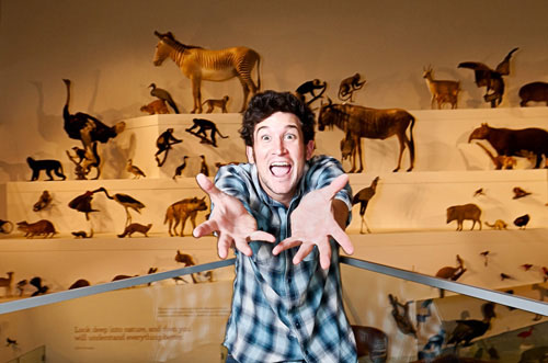
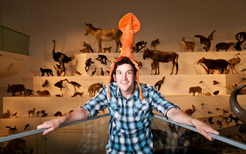
In fact, he was getting very excited about the whole thing.

Dave Lamb getting very excited

er, OK Dave, that’s a little too excited.

That's too excited, Dave

Early Morning at the Museum

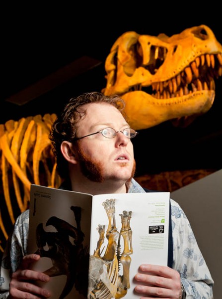
It was early morning at the Melbourne Museum. All was quiet. There was no one about, except for Ben McKenzie, Petra Elliott and Dave Lamb of Museum Comedy, me, a few security personnel, the cleaning crew, some early starters, the admin staff, the cafe staff, a few dozen researchers and… But it was quiet, very quiet.

What was that? - Ben McKenzie and a dinosaur

We had an hour to make magic, or at least enough images for the Museum Comedy publicity. So, a couple of light stands, Nikon flash units, umbrellas and camera and tripod got trekked about to several locations in the museum and an hour later we were done and packing up as the first sight-seers arrived.

Thanks to the staff of the Melbourne Museum for letting us play with the exhibits.

In a Hallway

I am working on a set of images that I want to use for my first attempt at an art folio. I came across some neat (and cheap) folios at Dane Creek Folios. I’ve purchased three to have a try and only realised the issue after I received them. They are sized for US Letter paper and not A4.

Try buying US Letter sized fine art photo paper in Australia. However, the good folks at Giclee Media are helping me with that (big thanks to Anne-Marie for her patience and information).

Last week I organised a series of test images to see if the idea would hold together and produce something worth putting into a folio. I was happy with the results I got but need to work on getting the exposure and contrast working better before I try printing them.

Here is one shot from the test. Once again, the subject is my good friend, the multi-talented Miss Sharon.

In a hallway

Deepest Darkest Tasmania

I planned a pleasant three-day weekend in Launceston, Tasmania. Little did I know when I set off that a volcano in Chile would scramble the holiday and most of the following week.

The volcanic ash cloud drifted into Australian air space and shut down all flights to and from Tasmania. The party I was travelling with decided to come home by boat from Devenport. The overnight Bass Straight crossing was smooth, but not a journey I wish to repeat. There is a reason why aeroplanes were invented.

But, the early morning light and occasional mists in and around Launceston were great photographic inspiration. Photos to follow.

Entally House, Hadspen, Tasmania

How I Shot a Volunteer

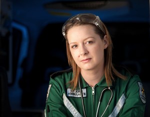
Sharon Carpenter, St John Ambulance

Sharon, Volunteer

Sharon and I work for the same organisation. The organisation’s internal website regularly features profiles of staff, showing what they do outside of work. And it was Sharon’s turn to be featured.

Amongst her many other interests and activities (she is also a medical guinea pig, read her story over at her blog), Sharon is a volunteer emergency worker with St John Ambulance.

We decided that apart from the uniform and tools of the trade, we would only hint at the work she does, rather than try to show her in a dramatic setting. The photo was first and foremost a portrait of Sharon. We wanted anyone who saw the photo to recognise a colleague in an unfamiliar setting.

For our backdrop we chose the interior of an ambulance. I didn’t want to show it in detail, but dimly lit and out of focus. I used a Nikon SB-28 speedlight to put some light in the ambulance interior. I also put a blue gel on it, partly to contrast with the green uniform and warm main light I was planning to use and partly to echo the blue emergency light of the ambulance.

Sharon, Volunteer

The main light is from a Westcott Apollo 28 inch softbox with a Nikon SB-28 speedlight. I was also using a Rosco 08 gold gel on the speedlight to simulate warm evening light. The speedlights were fired using Paul Buff Cybersync remote triggers.

To get the light as soft as possible, the softbox was placed at left of frame as close to Sharon as I could get it without being it in the shot. The 200mm lens I used gave me an out of focus background and kept the focus on Sharon.

Sharon, Volunteer

Sometimes it Just Doesn’t Work

Usually I don’t mind it so much if a planned photographing session doesn’t produce usable results because I generally learn something in the process; but not always.

I have just spent a very frustrating day trying to photograph a glass. The book Light: Science & Magic has a very good chapter on how to light glass. I had tried it very briefly on a previous occasion and got a result good enough to give me encouragement.

The technique for photographing a glass on a white background (in brief) is to have the white background the same size as the field of view of the camera, then bounce the light off the background back through the glass. Buy the book for the full explanation.

I set up the camera and the background, then carefully masked out the area of the camera’s field of view (not easy by yourself). Once that was done I began shooting.

Two problems emerged immediately. I was getting good definition of the sides and stem, but no definition of the rim of the glass. And the white base the glass was sitting on wasn’t getting enough light and was being rendered as a dirty gray. Not good. The only thing I can think of was that I set the glass and camera up too far away from the background. I’ll try that one again when I have the time to go through the masking process again.

In an attempt to gain some usable images, I switched to a macro lens, filled the glass with water, moved in very close and photographed food dye drops in the water.

Two problems immediately emerged. The macro lens showed up every flaw and smudge on the glass; and no matter how I tried, even at f16 I couldn’t get enough of the colouring in focus to produce a usable image.

After spending a lot of time trying to get a glass spotlessly clean and work out a way to get the drops to fall exactly in my very narrow zone of focus, I gave up.

Somedays it just doesn’t work.

Fast Photography

On the 19th March, 2010, a couple of friends and I went to Phillip Island for a day out at the classic car races.

Last year I was disappointed with the photos I took, so this year I was determined to do better. Last year I came home with a lot of blurry photos, so concentrating on getting a decent shutter speed and holding the camera still was my goal.

I set the ISO at 800 and the program mode to aperture priority at f8. This gave me a shutter speed of around 1/1000.  I turned the auto focus off and manually focused on a section of the track in front of me. As the cars came out of the fast right-hand corner at the bottom of the main straight, I tracked them until they reached my pre-focused spot, then I pressed the shutter.

I got some good results in terms of sharpness and the position of the car, however, my lack of a longer tele lens (I was using a 200mm) and the fact that I don’t have access to the track, meant that the images were still rather dull.

So I wandered off to the pits and tried to make some interesting images there.

Here is a gallery of the best ten photos of the day.

The Top Twelve Project

Just before Christmas I read two blog posts on the same day. They were both about photography, by different photographers coming from different perspectives. But both posts made the same point: when trying to attract the attention of a potential client, or just people who might be interested in your work, less is more.

Over at The Online Photographer, Mike Johnston explains his thoughts as he looks through a photographer’s online portfolio. He comments on what is and isn’t helpful to someone looking for great images.

And what does he find? Too many gallery links that don’t indicate what lies beyond, interface design and navigation that get in the way of looking at the images and just way too much stuff to wade through.

Scott Kelby takes a look at an online portfolio and has a hypothetical conversation with the photographer about why he has so many images and why he has ranked them in that way.

Both Mike and Scott make the same point, why don’t photographers just show their best 10, 20 or 40 images, instead of hundreds. Not all of that lot can be winners or potential work-getters.

This set me thinking: what impression am I giving online? Apart from a few images on this blog, my online presence is mostly the 1000 plus images at the sharing site ipernity.

If anyone actually managed to wade through this many photos, what would they think of my photography? What am I saying about what I do?

The images I have sent to ipernity cover a vast range of topics. Some I have taken in an attempt to show creativity, some are holiday shots, some are there because I wanted others to be able to see them easily and some are experiments.

Those 1000 plus photos don’t project the image of my photography I would like to present to the world.

So, as a result of reading those two articles, I have started the Top Twelve Project. I have added a new Top Twelve page to the site, accessible from the tab at the top.

This page will give access to a gallery of 12 images. At the moment these are my favourite images from the last two years. Trying to choose the best 12 from the thousands I have taken over the last 24 months was a daunting task and I would be the first to admit that the choice might not be perfect.

The challenge now is to discipline myself to update this gallery as I take new images that I judge to be better than at least one of the ones that are there.

So, it is with great pleasure that I declare my Top Twelve Project open. Thanks to Mike Johnston and Scott Kelby for prompting this change of direction.