Looking back

From time to time I go back through my store of images; looking for usable ones I missed the first time, or ones that I can extract more from due to new tools, more knowledge or just a different idea.

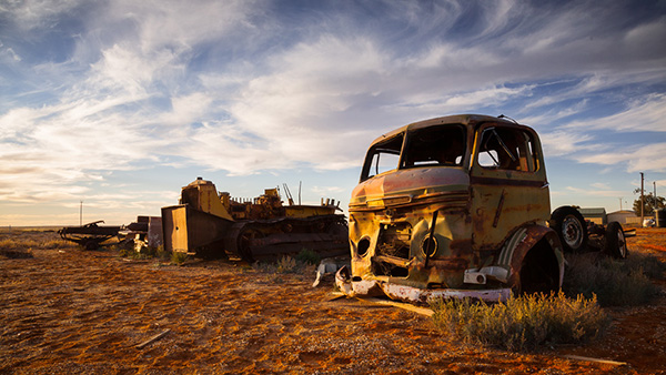
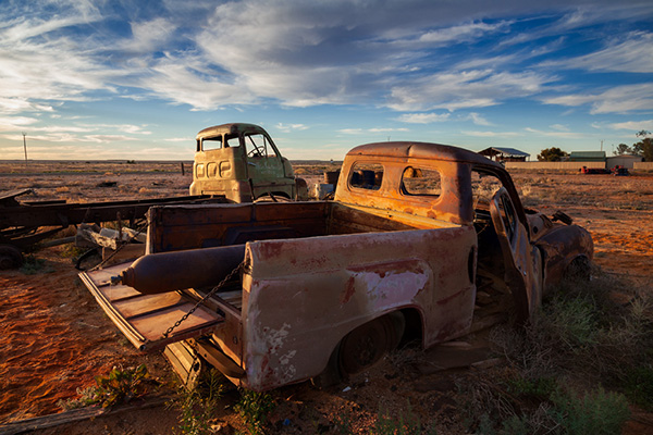
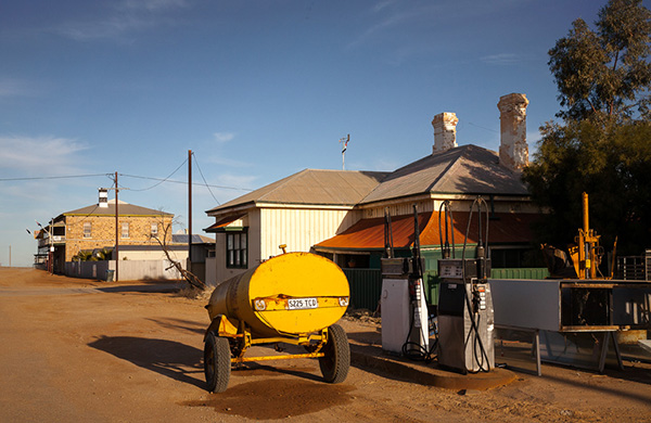
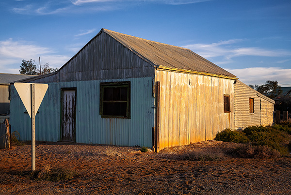
Recently I revisited images I took in the South Australian town of Marree during a trip in 2012.

At the time I was after a strong evening summer sun look, but wasn’t very happy with the colour in the shots. I have revisited them with new tools and some different techniques and managed to get them to be much closer to what I envisaged at the time.

Don’t forget to go back through your archives to find the hidden gems.


Marree, South Australia

A day with Joshua Holko

Like many photographers, I suffer from a tendency to GAS (Gear Acquisition Syndrome). For a while now I have been aware that the quality of my prints and skills as a printer haven’t been improving and fall well short of what is expected of a fine art print. First solution is more megapixels, right? So I upgraded my camera. This resulted in bigger prints but didn’t do much for my ability to print, so new printer, more software, more plugins, still looking for that magic bullet.

Then I happened upon the website of Melbourne-based landscape photographer Joshua Holko. Joshua has won many awards and regularly leads photograph trips to places such as Iceland, the arctic and Antarctic.

After an exchange of emails, we arranged a day for me to take advantage of Joshua’s mentoring program. And what an eye-opener that day was.

Starting with shooting technique we discussed the entire workflow needed to produce a gallery quality print. Joshua critiqued some prints I had brought with me, then spent several hours taking me through a Photoshop workflow that produced much better results than I would have imagined.

And to prove that more gear isn’t the answer, Joshua then produced a beautiful, detailed print from a file from my old camera, not the fancy new one.

Spend a little time to go through Joshua’s website and his list of achievements, this man knows what he is doing.

Before you give in to the symptoms of GAS, try learning how to use and get the most out of the equipment you already have, that might solve the problem.

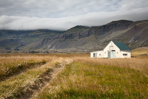
A farm in Iceland

The Top Twelve Project

Just before Christmas I read two blog posts on the same day. They were both about photography, by different photographers coming from different perspectives. But both posts made the same point: when trying to attract the attention of a potential client, or just people who might be interested in your work, less is more.

Over at The Online Photographer, Mike Johnston explains his thoughts as he looks through a photographer’s online portfolio. He comments on what is and isn’t helpful to someone looking for great images.

And what does he find? Too many gallery links that don’t indicate what lies beyond, interface design and navigation that get in the way of looking at the images and just way too much stuff to wade through.

Scott Kelby takes a look at an online portfolio and has a hypothetical conversation with the photographer about why he has so many images and why he has ranked them in that way.

Both Mike and Scott make the same point, why don’t photographers just show their best 10, 20 or 40 images, instead of hundreds. Not all of that lot can be winners or potential work-getters.

This set me thinking: what impression am I giving online? Apart from a few images on this blog, my online presence is mostly the 1000 plus images at the sharing site ipernity.

If anyone actually managed to wade through this many photos, what would they think of my photography? What am I saying about what I do?

The images I have sent to ipernity cover a vast range of topics. Some I have taken in an attempt to show creativity, some are holiday shots, some are there because I wanted others to be able to see them easily and some are experiments.

Those 1000 plus photos don’t project the image of my photography I would like to present to the world.

So, as a result of reading those two articles, I have started the Top Twelve Project. I have added a new Top Twelve page to the site, accessible from the tab at the top.

This page will give access to a gallery of 12 images. At the moment these are my favourite images from the last two years. Trying to choose the best 12 from the thousands I have taken over the last 24 months was a daunting task and I would be the first to admit that the choice might not be perfect.

The challenge now is to discipline myself to update this gallery as I take new images that I judge to be better than at least one of the ones that are there.

So, it is with great pleasure that I declare my Top Twelve Project open. Thanks to Mike Johnston and Scott Kelby for prompting this change of direction.

The War of Art

Resistance is Futile…

A little while ago I bought the excellent book ‘The War of Art‘ by Steven Pressfield. It is an excellent little book that examines the main problem that artists and writers have: sitting down and being arty and writey.

As a photographer and business writer with aspirations to become a ‘proper’ writer, I know only to well how easy it is to find distractions instead of sitting down to work. Cleaning out the fridge suddenly becomes very important.

Pressfield tackles the issue head-on and blames ‘Resistance’. Resistance causes procrastination. Pressfield goes on to explain all about resistance and how to overcome it and achieve what you want to achieve. people say it is a very good book.

I will probably get around to reading it soon.

Things that Have Changed the Way I Think…

Shortly after joining Ipernity, I came across a very talented photographer from Iceland: Ragnheidur.

April in Iceland

Her image collection included stunning images of the Icelandic scenery, mountains, desolate coastline, windswept plains. The images were often dark and made with very long exposures, giving them an eerie almost ghostly feel.

Frankly I was extremely jealous of her talent, her images and the amazing country she had to work with. I wished I had dramatic, harsh scenery like that to photograph, instead of the boring normal scenery around me.

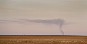
Then I started thinking: “I do live in a country with harsh scenery, it’s just different”. I began to take notice of what was special about our Australian landscape. It is a harsh dry flat place for most of the state of Victoria. In the wheatlands north of Horsham, the horizon looks as if it has been drawn with a straightedge. The interest is in the texture, colour and light. In the late afternoon the wheat stubble glows gold and the clouds take on a mauve tint.

I began to drive into areas I once bypassed as being totally without photographic interest and I began exploring what is there. I am slowly building a set of images of the Australian landscape the way I see it.

My images don’t look anything like the ones Ragnheidur takes, but it is thanks to her that I am now seeing my own landscape. Thanks Ragga.

Smoke from a Distant Fire

Edit September 2010

In June 2010 I spent 2 weeks in Iceland and got to meet Ragga and thank her in person.