Head Shot

My good friend Ben McKenzie and I were discussing some photos that Ben could use for publicity. We decided to start with a traditional black and white head shot that could be used as an avatar for Twitter (@labcoatman) and other online uses, and could also be printed and handed out when needed.

Ben McKenzie

The aim of the photo was to let Ben’s personality come to the fore, so I decided to use the classic Hollywood-style clam shell lighting. One umbrella is placed directly in front and slightly above the victim’s eyeline with a second umbrella lower down and set two stops below the main light to fill in the shadows and put light in the eyes. The white back drop is a piece of foamcore clamped to a stand.

It is a simple setup and one that gives very even results. The rest I left up to Ben.

Ben McKenzie

And yet again…

How I Shot the Labcoatman

Ben McKenzie is a friend and mild-mannered work colleague, but in reality, he is the Man in the Lab Coat.

Ben McKenzie

Apart from working with me, Ben is an actor, comedian, writer and improviser who specialises in science comedy, and therefore usually describes himself as a “scientician”.

Ben has written, performed and produced a series of comedy science lectures as “The Man in the Lab Coat” since 2004. His shows have appeared in both the Adelaide and Melbourne Fringe Festivals, the Melbourne International Comedy Festival, and as part of the National Science Week programme.

Ben and friend

A trained public speaker, Ben has made numerous appearances for schools, corporations, scientific institutions, charity events and art gallery openings, always able to find a unique scientific angle on proceedings.

The aim of this series of shots was to provide Ben with several images with a plain white background that could be used for promotional purposes.

Have I got a deal for you

The set up was simple. The white backdrop is the wall of the living room in my house. The main light is a Nikon SB-28 speedlight fired through a white umbrella at the left of camera to produce a large, soft light. At the right of the image was a large sheet of white foam core acting as a reflector. There is another SB-28 directly behind Ben aimed at the wall to make it white. The flashes were triggered by Cybersyncs.The rest of the work was left to Ben.

This was a very enjoyable shoot. Ben is an experienced public speaker and actor and is very relaxed in front of a camera. All I had to do was stand there and press the shutter button.

Ben, the Man in the Lab Coat

Sometimes it Just Doesn’t Work

Usually I don’t mind it so much if a planned photographing session doesn’t produce usable results because I generally learn something in the process; but not always.

I have just spent a very frustrating day trying to photograph a glass. The book Light: Science & Magic has a very good chapter on how to light glass. I had tried it very briefly on a previous occasion and got a result good enough to give me encouragement.

The technique for photographing a glass on a white background (in brief) is to have the white background the same size as the field of view of the camera, then bounce the light off the background back through the glass. Buy the book for the full explanation.

I set up the camera and the background, then carefully masked out the area of the camera’s field of view (not easy by yourself). Once that was done I began shooting.

Two problems emerged immediately. I was getting good definition of the sides and stem, but no definition of the rim of the glass. And the white base the glass was sitting on wasn’t getting enough light and was being rendered as a dirty gray. Not good. The only thing I can think of was that I set the glass and camera up too far away from the background. I’ll try that one again when I have the time to go through the masking process again.

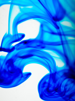
In an attempt to gain some usable images, I switched to a macro lens, filled the glass with water, moved in very close and photographed food dye drops in the water.

Two problems immediately emerged. The macro lens showed up every flaw and smudge on the glass; and no matter how I tried, even at f16 I couldn’t get enough of the colouring in focus to produce a usable image.

After spending a lot of time trying to get a glass spotlessly clean and work out a way to get the drops to fall exactly in my very narrow zone of focus, I gave up.

Somedays it just doesn’t work.

Fast Photography

On the 19th March, 2010, a couple of friends and I went to Phillip Island for a day out at the classic car races.

Last year I was disappointed with the photos I took, so this year I was determined to do better. Last year I came home with a lot of blurry photos, so concentrating on getting a decent shutter speed and holding the camera still was my goal.

I set the ISO at 800 and the program mode to aperture priority at f8. This gave me a shutter speed of around 1/1000.  I turned the auto focus off and manually focused on a section of the track in front of me. As the cars came out of the fast right-hand corner at the bottom of the main straight, I tracked them until they reached my pre-focused spot, then I pressed the shutter.

I got some good results in terms of sharpness and the position of the car, however, my lack of a longer tele lens (I was using a 200mm) and the fact that I don’t have access to the track, meant that the images were still rather dull.

So I wandered off to the pits and tried to make some interesting images there.

Here is a gallery of the best ten photos of the day.

The Top Twelve Project

Just before Christmas I read two blog posts on the same day. They were both about photography, by different photographers coming from different perspectives. But both posts made the same point: when trying to attract the attention of a potential client, or just people who might be interested in your work, less is more.

Over at The Online Photographer, Mike Johnston explains his thoughts as he looks through a photographer’s online portfolio. He comments on what is and isn’t helpful to someone looking for great images.

And what does he find? Too many gallery links that don’t indicate what lies beyond, interface design and navigation that get in the way of looking at the images and just way too much stuff to wade through.

Scott Kelby takes a look at an online portfolio and has a hypothetical conversation with the photographer about why he has so many images and why he has ranked them in that way.

Both Mike and Scott make the same point, why don’t photographers just show their best 10, 20 or 40 images, instead of hundreds. Not all of that lot can be winners or potential work-getters.

This set me thinking: what impression am I giving online? Apart from a few images on this blog, my online presence is mostly the 1000 plus images at the sharing site ipernity.

If anyone actually managed to wade through this many photos, what would they think of my photography? What am I saying about what I do?

The images I have sent to ipernity cover a vast range of topics. Some I have taken in an attempt to show creativity, some are holiday shots, some are there because I wanted others to be able to see them easily and some are experiments.

Those 1000 plus photos don’t project the image of my photography I would like to present to the world.

So, as a result of reading those two articles, I have started the Top Twelve Project. I have added a new Top Twelve page to the site, accessible from the tab at the top.

This page will give access to a gallery of 12 images. At the moment these are my favourite images from the last two years. Trying to choose the best 12 from the thousands I have taken over the last 24 months was a daunting task and I would be the first to admit that the choice might not be perfect.

The challenge now is to discipline myself to update this gallery as I take new images that I judge to be better than at least one of the ones that are there.

So, it is with great pleasure that I declare my Top Twelve Project open. Thanks to Mike Johnston and Scott Kelby for prompting this change of direction.

sRGB and other Colour Spaces

A recurring theme on many photography forums is the issue, “my photos look like crap when I upload them to a web site, what’s wrong”.

Basically, the problem is colour spaces and how they are interpreted by different devices. There is a mass of information about colour spaces on the web, not all of it useful, or even correct.

I have seen a lot of different explanations for what causes the problem, and I have seen a lot of different explanations of how to fix the problem. Unfortunately, a lot of these are wrong; or worse, suggest a work-around that, while they might work for the poster, totally screw up someone trying to learn proper colour management.

The good news is that you don’t need to know everything there is to know about colour spaces. All you need to know is enough to do the imaging functions you want to do.

In my case, that’s ProPhotoRGB for working within Adobe Photoshop and sRGB for displaying the result on-line. I don’t know very much about either of those colour spaces, except for the fact that they work when used for the intended purpose.

ProPhotoRGB (in 16-bit mode) because several people who I admire and trust (they are long-time pros who consistently turn out good work) have convinced me it is the best colour space to work in to get the best out of a RAW file for printing.

sRGB because, if you want to display your work on the web or any other display device, it is the only game in town.

A point to understand and remember: A computer monitor (or just about any other type of display such as a camera LCD screen) is a low-resolution device. Most computer monitors are 72 pixels per inch and just barely able to display sRGB correctly.

Forums are filled with discussions about the ability of operating systems, different web sites and different browsers and their ability to display colour spaces correctly, and a lot of this is true, to a point. But, it all gets brought down to the lowest common denominator though, the display device. And a computer monitor is a low-resolution device.

A statement I often see is: “I want others to see my images as I intend them to look”; a nice sentiment, but impossible. You have no control over how another person’s monitor is adjusted.

I prepare my images at home on an expensive, calibrated colour monitor. When I view them on my work machine, they look too red. My work monitor isn’t calibrated, just operating the way it came out of the box.

You can’t control how another person sees your images, and if your monitor isn’t colour calibrated, you have no way of knowing if you are seeing your images correctly.

To give your images the best chance of being viewed correctly on someone else’s monitor; first make sure your monitor is calibrated with a reliable device, such as a Datacolor Spyder or a Gretag-Macbeth. Then, before you upload your image to a web site, convert it to sRGB.

ProPhotoRGB discussion at Luminous Landscape.

A discussion of colour management and colour theory at Image Science.

Things that Have Changed the Way I Think…

Shortly after joining Ipernity, I came across a very talented photographer from Iceland: Ragnheidur.

April in Iceland

Her image collection included stunning images of the Icelandic scenery, mountains, desolate coastline, windswept plains. The images were often dark and made with very long exposures, giving them an eerie almost ghostly feel.

Frankly I was extremely jealous of her talent, her images and the amazing country she had to work with. I wished I had dramatic, harsh scenery like that to photograph, instead of the boring normal scenery around me.

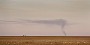
Then I started thinking: “I do live in a country with harsh scenery, it’s just different”. I began to take notice of what was special about our Australian landscape. It is a harsh dry flat place for most of the state of Victoria. In the wheatlands north of Horsham, the horizon looks as if it has been drawn with a straightedge. The interest is in the texture, colour and light. In the late afternoon the wheat stubble glows gold and the clouds take on a mauve tint.

I began to drive into areas I once bypassed as being totally without photographic interest and I began exploring what is there. I am slowly building a set of images of the Australian landscape the way I see it.

My images don’t look anything like the ones Ragnheidur takes, but it is thanks to her that I am now seeing my own landscape. Thanks Ragga.

Smoke from a Distant Fire

Edit September 2010

In June 2010 I spent 2 weeks in Iceland and got to meet Ragga and thank her in person.

Art Filters

Over on The Online Photographer, Mike Johnston has a post about the new Olympus E-620 DSLR. Mike has some interesting, and not entirely serious, things to say about some of its more interesting features.

I enjoyed his comments and assessment of the ‘art filters’ and agreed with his opinions; after all we would all like Creativity to be added to our photos.

After thinking about it for a bit, I decided I really would like an ‘art filter’ on my camera. Specifically, I want a Caravaggio filter.

He might not have known anything about white balance, histograms, ISO or pixel pitch but he certainly understood light and how to use it.

If I could light a portrait like this, I’d be a very happy photographer.